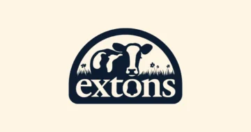
Embracing Tradition with a Fresh Slice: Our New Logo
At Extons, where the passion for cheese has been at the heart of our journey since 2000, we’ve embarked on an exciting visual transformation. Our new logo is more than just a symbol; it’s a reflection of our dedication to quality, innovation and strong family values.
The decision to refresh our logo was a thoughtful one. Our original emblem, with the cow, the bell cleverly nestled in the ‘O,’ and our signature navy blue, has been a part of Extons since the beginning. These elements are more than symbols; they are a representation of our legacy. We knew we needed a change, but it was essential to retain the essence that makes Extons unmistakably ours.
In our pursuit of a contemporary design, we took a meticulous approach to streamline and simplify our logo. The cow and bell illustration underwent a makeover, shedding unnecessary details and enhancing clarity. This redesign ensures our logo works seamlessly across various platforms – from thumbnail sized profile images on social media to 12ft high on the side of our new lorries.
A mark inspired by cheese
Our refreshed logo draws inspiration from the very core of our business – cheese. Housed in an arch, mirroring the traditional round shape of a cheese wheel, the logo exudes authenticity. This arch design isn’t just limited to the logo; it extends throughout our brand rollout, creating a cohesive visual identity that speaks to our commitment to quality.
A palette of richness
We’ve also introduced a silky, cream tone to our palette. This addition not only complements the navy blue but also symbolizes the richness and freshness of our cheese products. It’s a subtle yet significant change that elevates our brand image and adds a touch of softness.
Typography refined
We understand the importance of the right typeface. As part of our logo overhaul, we’ve updated the Extons typeface to exude a more established and timeless feel. This enhancement complements the refined visual elements, presenting a cohesive and polished brand identity.
Conclusion
Our new logo is more than just a visual update – it’s a celebration of our journey and a nod to the future. At Extons, we’re committed to evolving with the times while staying true to our core family values. As our logo makes its mark in the industry, it symbolizes our dedication to quality, innovation, and timeless appeal.
-
Embracing Tradition with a Fresh Slice: Our New Logo
Embracing Tradition with a Fresh Slice: Our New Logo15 January 2024 At Extons, where the…
-
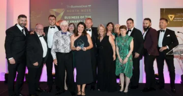
North West Business Award Winners
North West Business Award Winners19 October 2023 A night to remember… Well we are nursing…
-
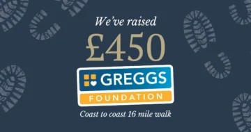
16 mile walk for Gregg’s foundation
16 mile walk for Gregg’s foundation11 October 2023 We took some time out of our…
-
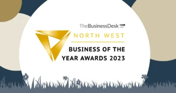
Shortlisted for the NW Business of the Year awards
Shortlisted for the NW Business of the Year awards19 July 2023 Well, we have some…
-
4 Golds at The International Cheese & Dairy Awards
4 Golds at The International Cheese & Dairy Awards1 July 2023 This week we had…